Last year I volunteered to support on the organisation of an event for the UX community at Ocado called O!UX.
The goal of the event was tocelebrate the User Experience craft in Ocado Technology by giving the UX community a chance to come together to learn, make connections, have fun and maximise our impact within the organisation.
We formed a small working group with reps in each of Ocado’s Dev Centres to orchestrate this event. Our team’s responsibilities included sourcing speakers, crafting the agenda, defining the event’s visual identity, and leading engaging sessions. Six of us collaborated to curate an remarkable event for a gathering of all 83 UXers working at Ocado.
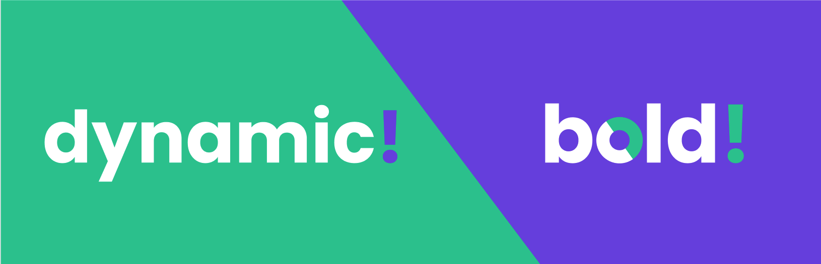
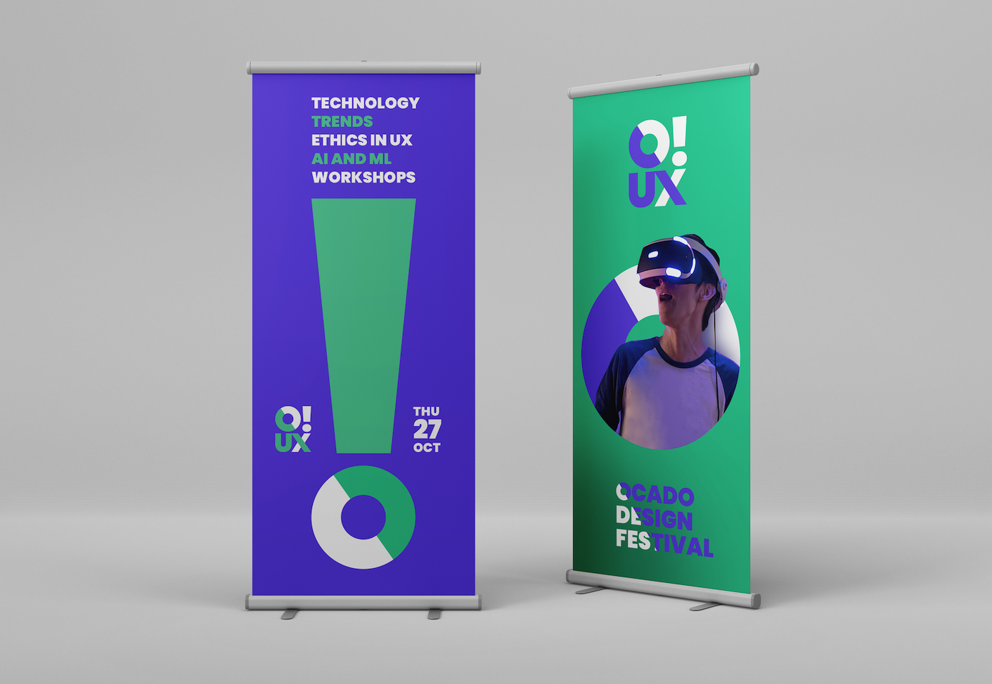
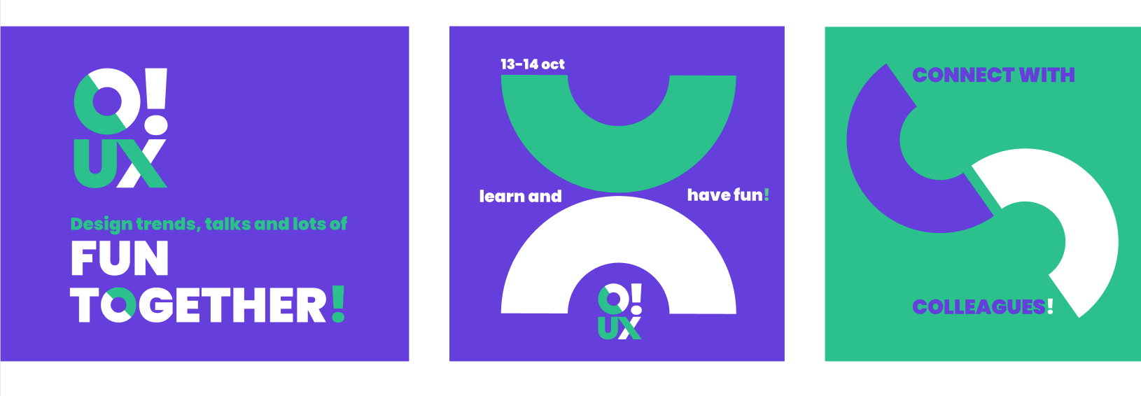
I designed the event's branding keeping the ideas of dynamism and vibrancy at the forefront of the design
Since we were a bunch of UX folks, we implemented UX methods and a user-centered approach. To understand our audience’s learning needs, we began by sending out a UserZoom survey to the internal UX community.
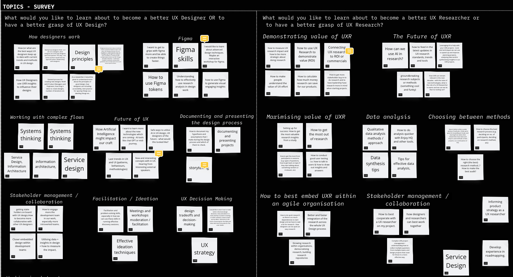
Mapping of topics suggested by the UX community
The UX community from Ocado collaborated with suggestions of topics and learning needs. We mapped those suggestions in a board and started planning the event.
We planned the agenda and reached out to speakers, organised workshops and activities for all 83 UX team members.
I focused the most on crafting the event’s branding design and art direction. I designed all the visual design material and instructed other designers involved on the visuals look and feel. I also organised activities, food and facilitated the event for my colleagues in Barcelona.
Building the event's branding
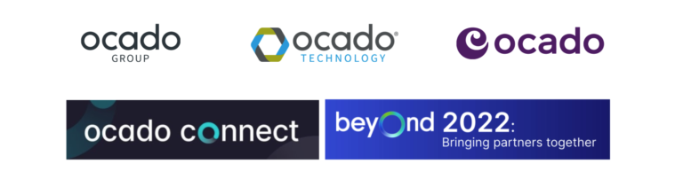
Ocado Group branding (examples of other internal events)
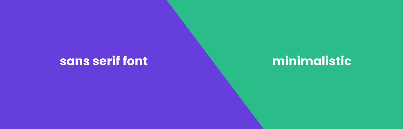
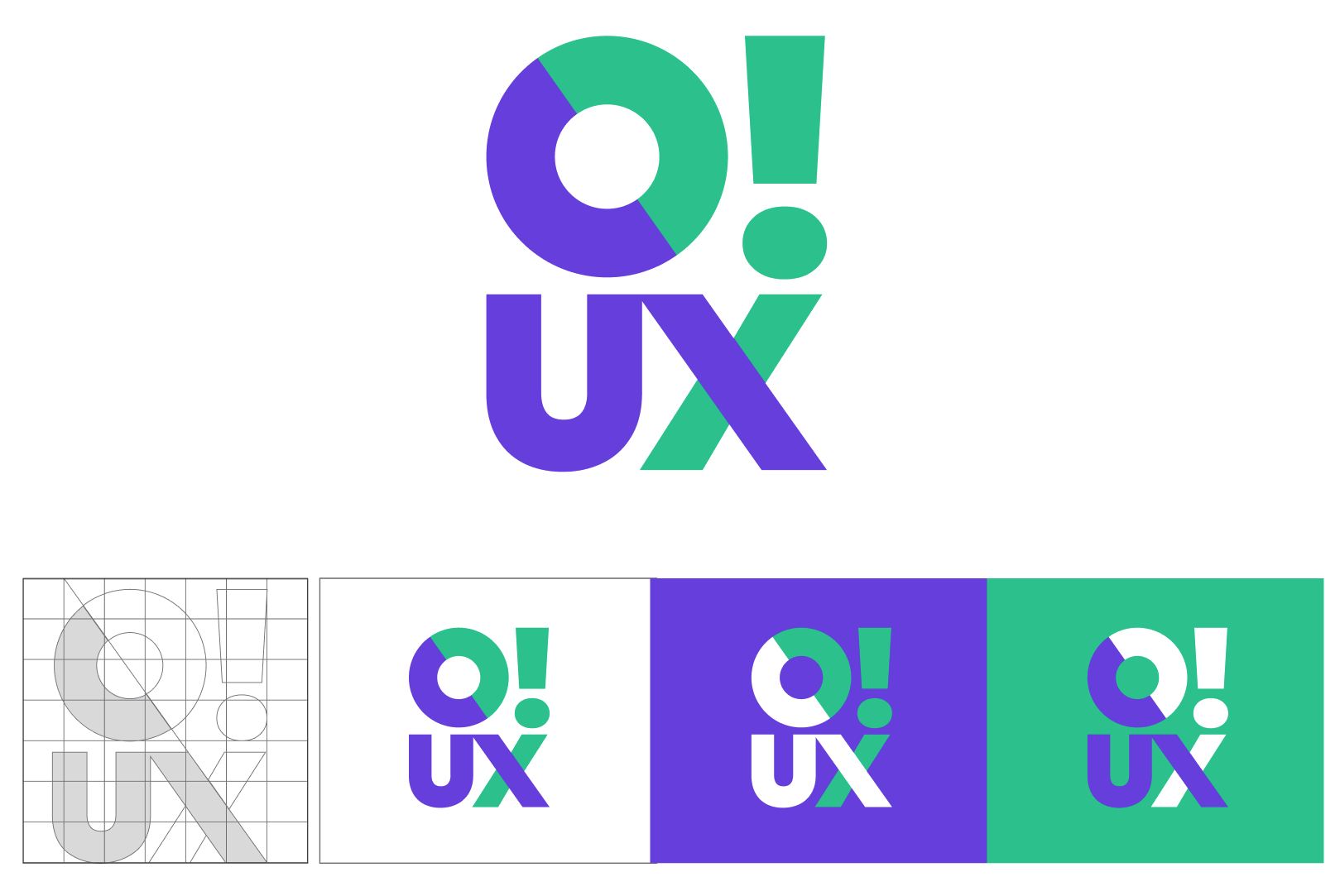
I looked at the Ocado Group style guide to understand in depth the brand’s visual identity and its adaptability for an internal event. It was interesting to note that “Ocado Connect” and “Beyond”, two internal initiatives, had this playful emphasis on the letter “O.” In terms of typography, a consistent approach for Ocado’s sub-brands was maintained throughout, using a minimalistic sans-serif typeface.
Other iternal events logotypes (not designed by me)
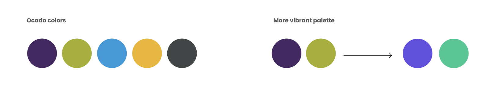
Colours
When it came to colours, I found out that for internal events, we had more flexibility to adapt the brand style. So, I used Ocaso’s brand colours as a starting point and boosted the vibrancy to give the event a fresh and lively vibe.
Usage of shapes and graphic elements
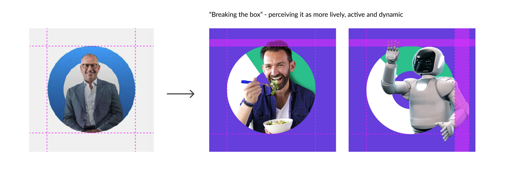
Ocado’s brand guidelines uses shapes and photos in a centered, aligned manner. My aim was to break the limits of those shapes, to give a sense of liveliness and dynamism into the O!UX brand.
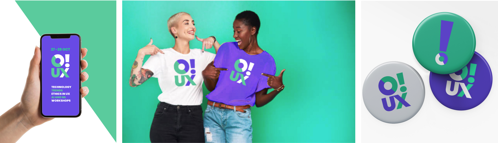
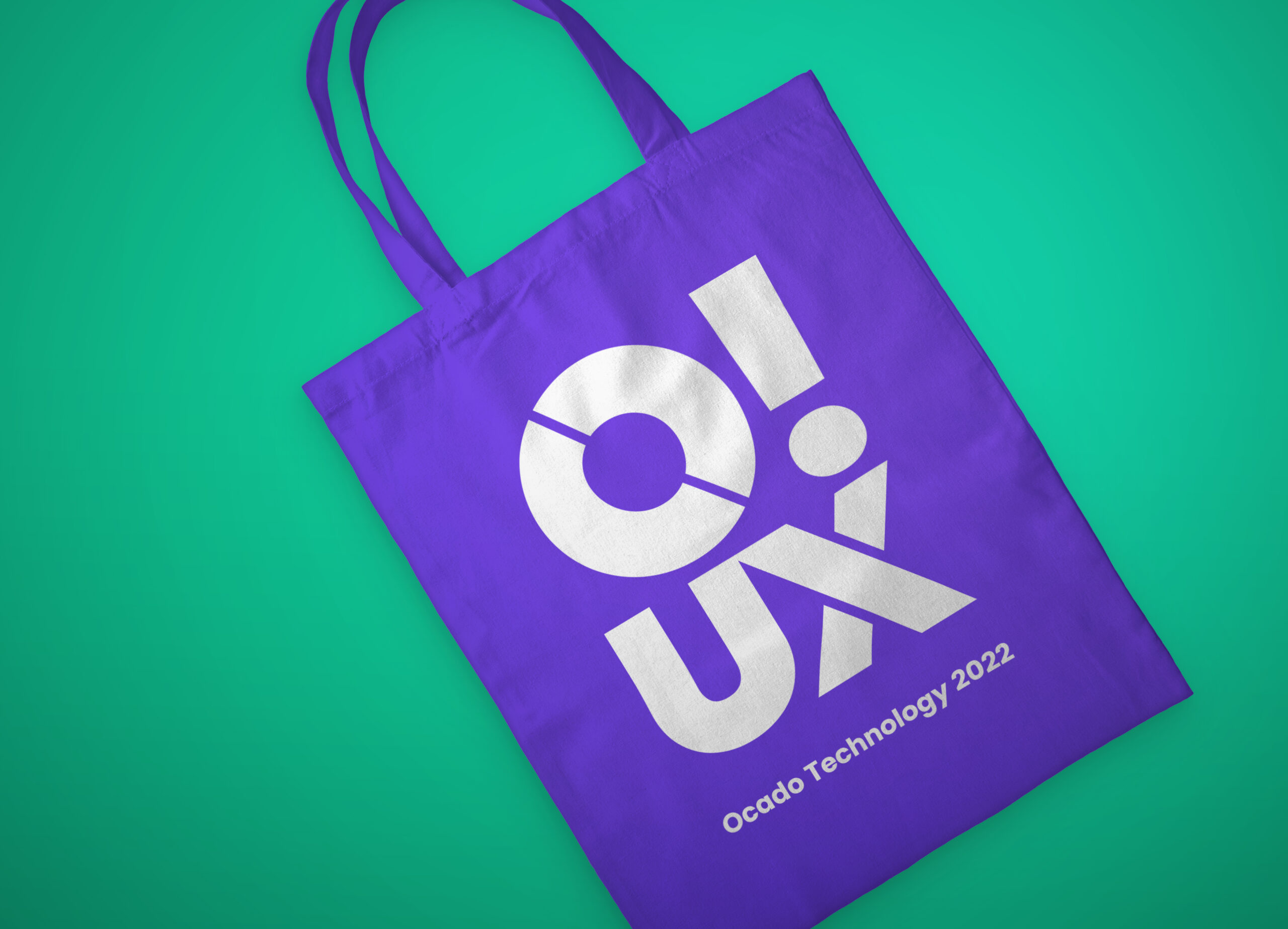
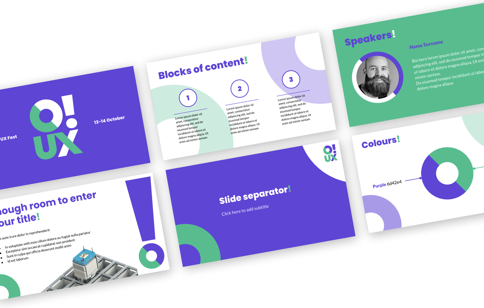
O!UX logo I designed for the event
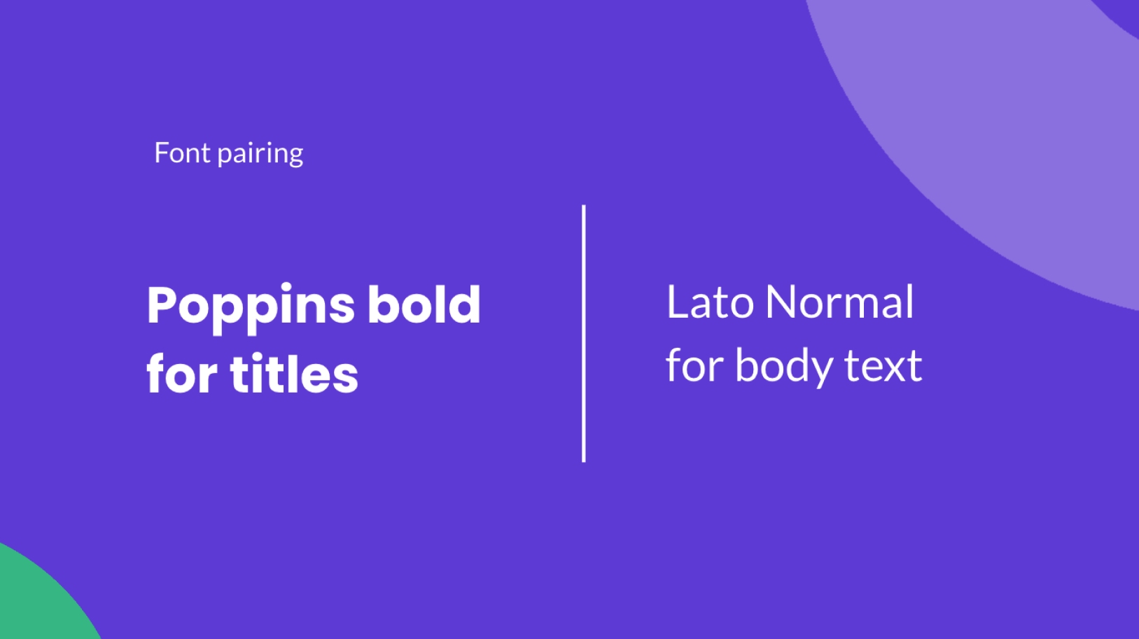
Presentation deck template I prepared for the event
It was great to have these 2 Days with the UX community across the Ocado organisation and enjoy things like: talks by external UX professionals, sessions by tooling experts (Figma, Userzoom…), Show & Tell from internal teams, workshops and social time!
After the event finished we asked for the events’ attendees feedback and got a very positive response!
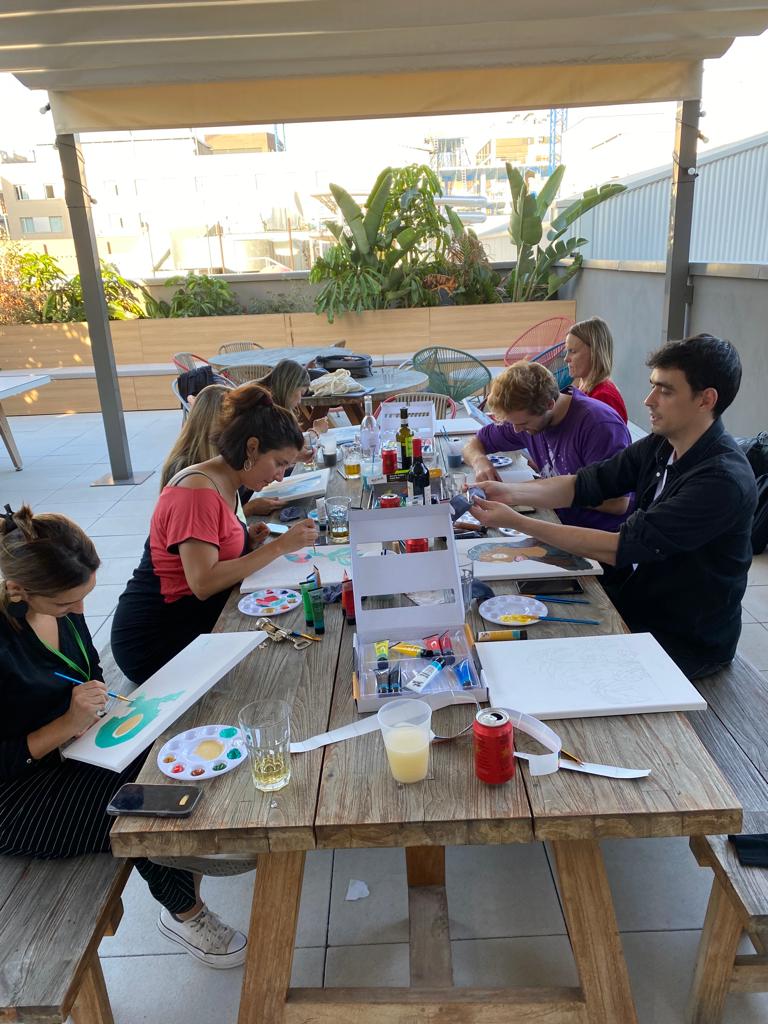
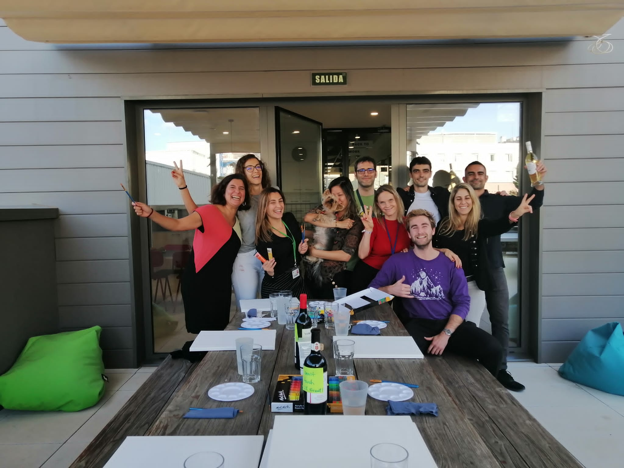
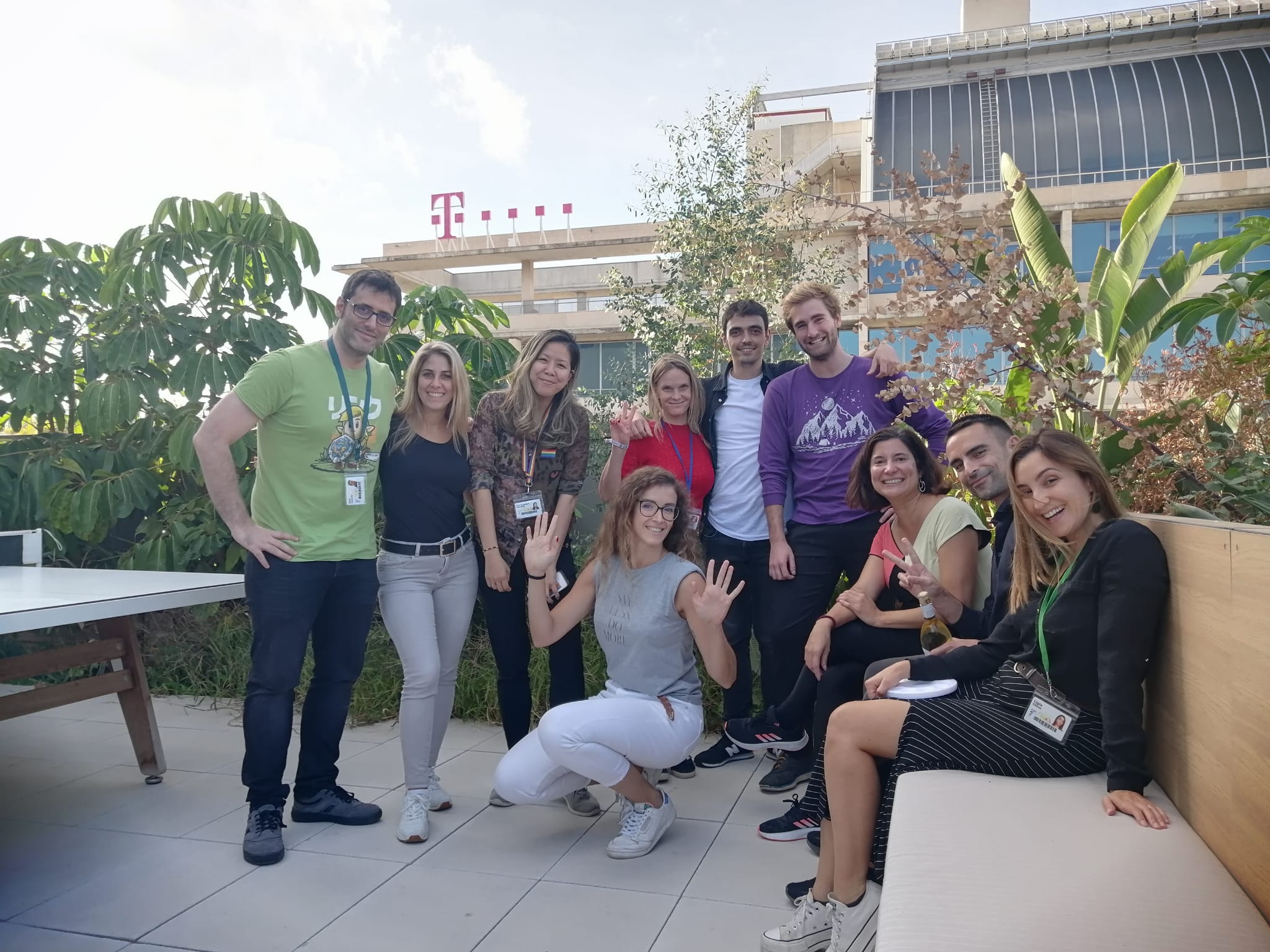
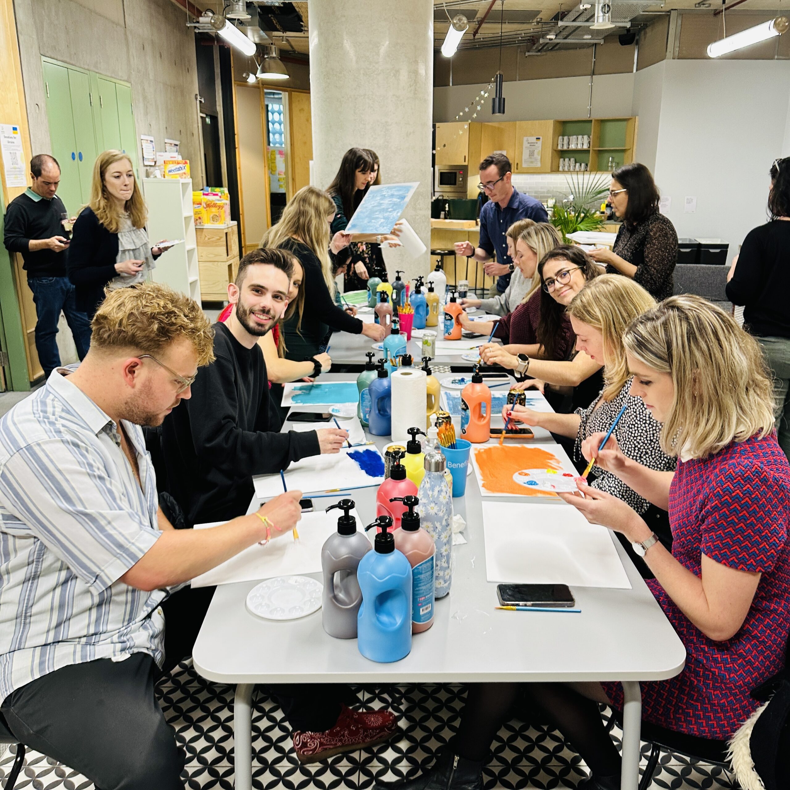
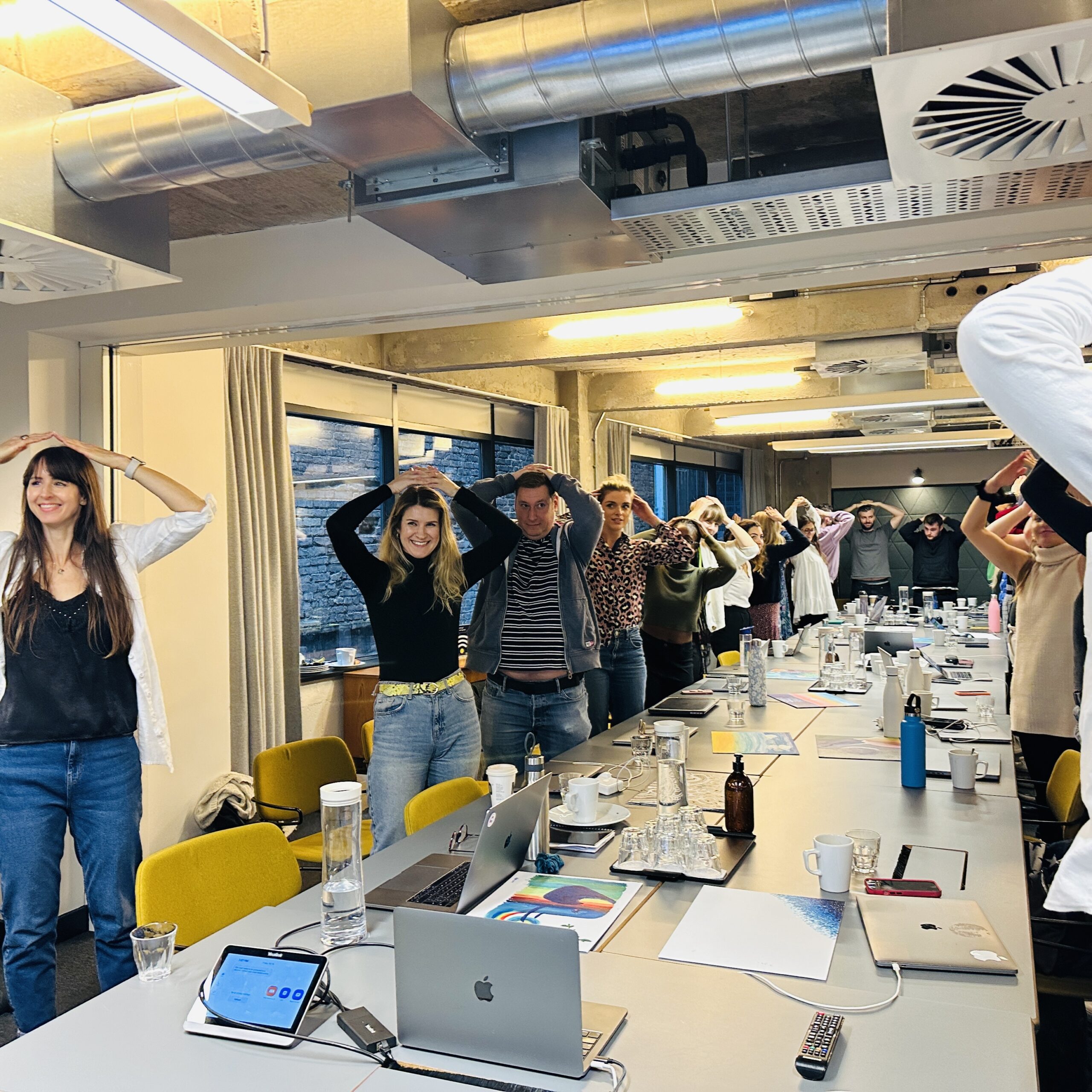
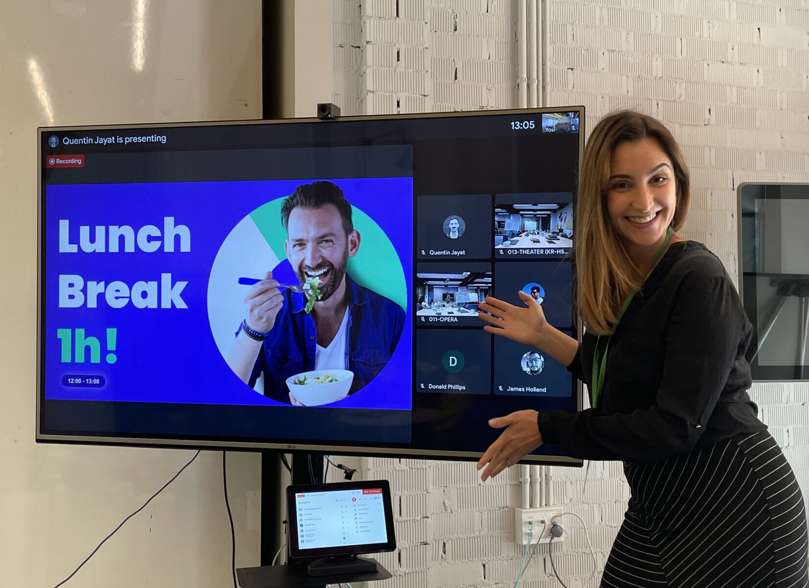
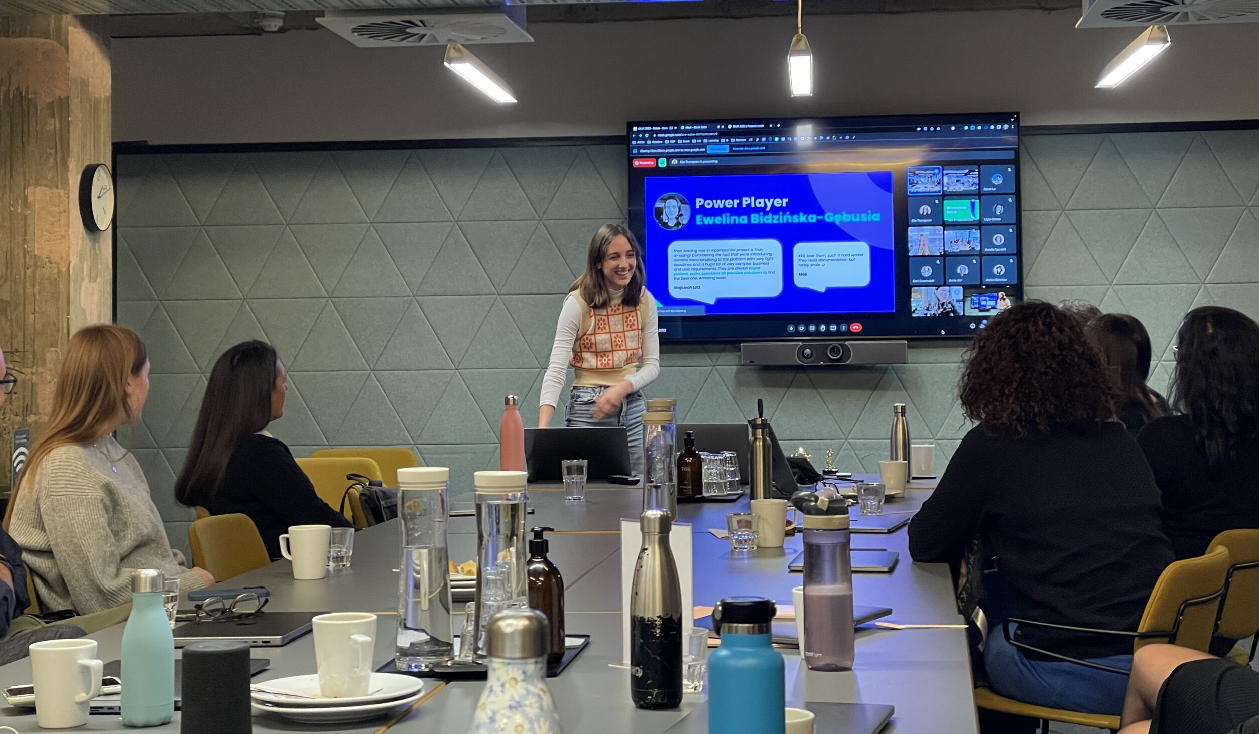
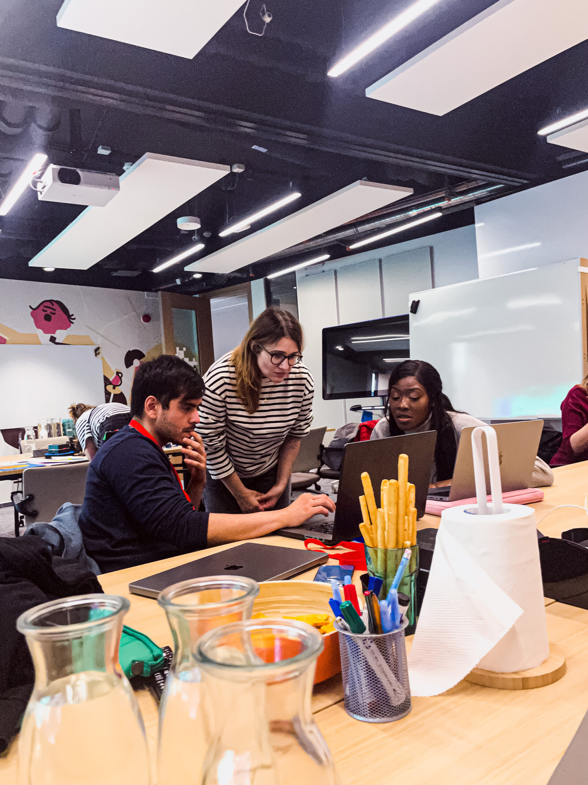
Some pics from the O!UX event
The event took place simultaneously in three cities where Ocado’s UX teams are located: Barcelona, London, and Krakow.
We had talks from internal and external speakers and lots of learning and social time with workshops and a Drink and Draw session.
What my peers said about the event:
Great job!!!!! I really enjoyed O!UX. Also, I love conference UI Theme 🙂 - the look, the animation, simply Amazing!!!! Thank you for everything!!!
Well done! This conference was such a great achievement and overall it was executed brilliantly! 🤩
Thank you all for all of the work that went in to planning this! It was so nice to have a day where we were all together as one big UX team - looking forward to next year already!
Learnings
Challenges and Solutions
We planned a lot but we had a few hiccups on the day that could have been potentially avoided with more testing and planning.
For example, we had an accessibility specialist that needed a screen reader but we had some issues with the audio when streaming to other locations, we could have avoided those issues by double checking all the tech equipment.
We also could have had better visibility of the plan, as there were questions in the lead up from people who were still not sure what to expect from the day. For future events we plan to:
Test all tech (and double-check everything!)
Check what all requirements from external providers/speakers
Create consistent comms about the event
Final thoughts
In a nutshell, my collaboration in the O!UX event at Ocado Technology was all about boosting our UX culture. Through branding, research, and project management, I contributed to its success. It was a blast – building a strong community, emphasising UX’s relevance, and even drawing in top talent. As the social glue in the team, I’m all in for keeping our UX culture thriving, and the O!UX event was a big step in that direction 🎉


