Designing beyond the feature factory trap

My role: UX Lead   //   Project timeline: 3 months  //  Company: Ocado Technology (OSP e-commerce platform) 

In product development, it’s common to fall into feature factory mode. However, in this project, we took a different approach by diving into UX discovery and testing to ensure that we delivered value with a feature request from one of Ocado’s partners.

Ocado Smart Platform (OSP) is an end-to-end eCommerce, fulfillment and logistics platform. I currently work in the e-commerce area designing experiences for Ocado and grocery retailers across all its platforms, including desktop web, web app and native apps.
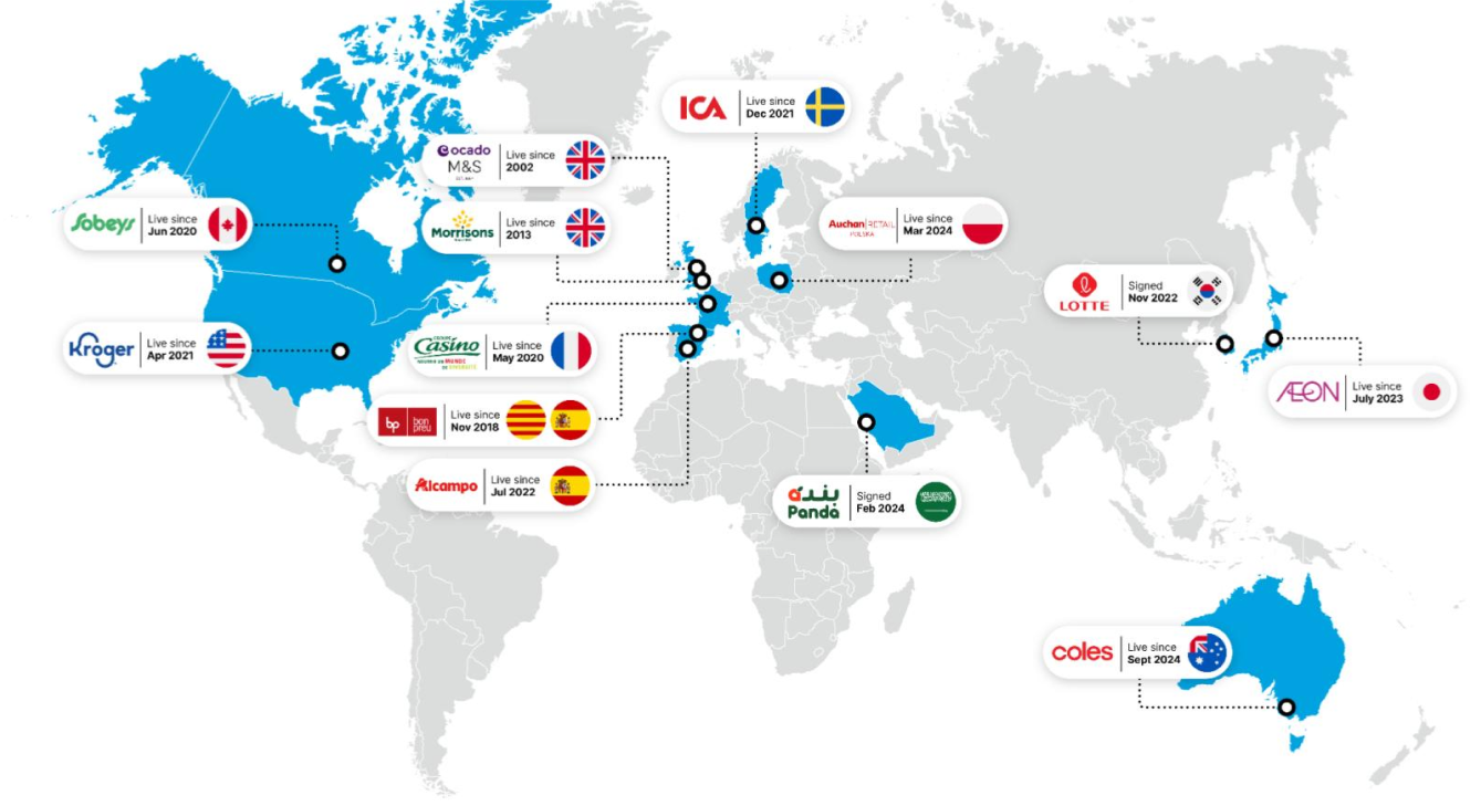
 

Ocado has 12 partners around the world that use the OSP platform

Problem

We received a feature request to add extra functionality to one of the features in the e-commerce platform (OSP). The request was to enable users to edit the quantity of an item they add to the Shopping Lists feature. Before diving into the feature development, I wanted to ensure that we were 'building the right thing' and addressing a real user need.

Outcome

Through user interviews, benchmarking research, ideation sessions, and usability testing, it was determined that users preferred to keep the existing system for editing quantities in the basket. However, a new sub-feature that allowed users to share lists received positive feedback. Based on this feedback and the lack of user interest in enabling quantities editing in Shopping Lists, the team decided to prioritise other projects with a higher impact on usability.

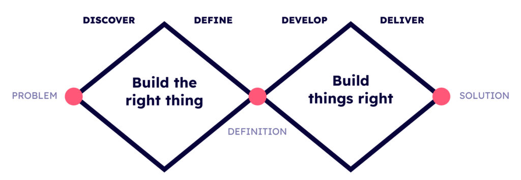
Double diamon framework

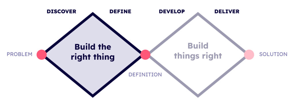
Instead of immediately diving into development and focusing on execution (building things right), we took a step back to ensure that this feature request would benefit both users and the business. To achieve this, we prioritised the first diamond from the ‘double diamond’ framework and conducted a thorough discovery phase. This allowed us to answer the critical question: Are we building the right thing?

The Shopping Lists feature and the request

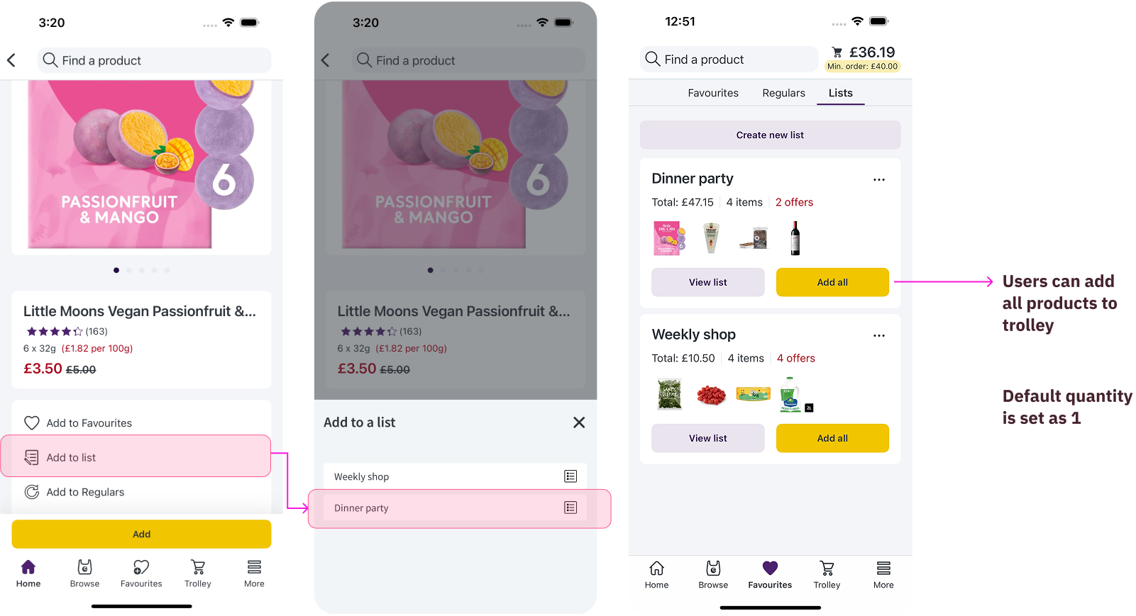
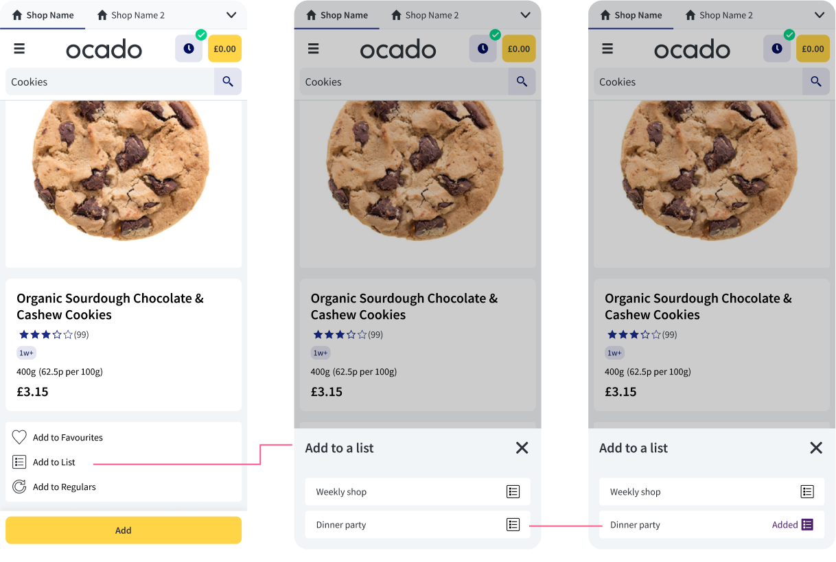
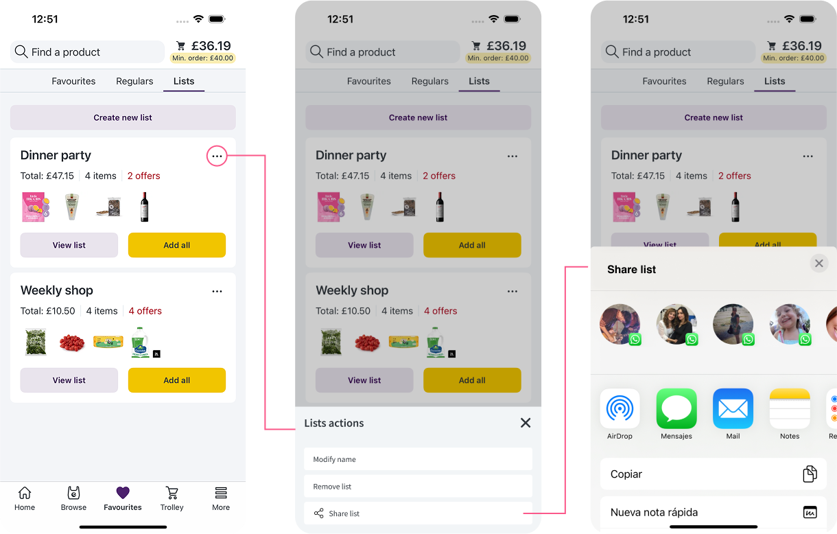
I started by looking at the current flow where users can add a product to a shopping list via a bottom sheet (or from the product details page). 

When the product is added, the quantity is set as 1. Those Lists are saved on the Lists page – where users can add all products from a list by clicking on an “Add all” CTA button.

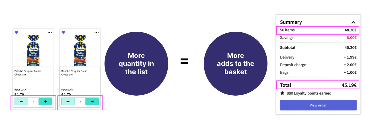
Once the products are added from the List to the Basket users can edit their quantity using a counter.

Retailers saw potential in allowing users to edit product quantities when adding items to their shopping lists. That meant that if an item quantity was set as 2 instead of 1 – when clicking on the ‘add all’ CTA button this change would lead to more adds to baskets, ultimately increasing the overall ticket value for online supermarkets.

Work process

To investigate this retailer’s hypotheses, I began by studying the current process of adding a product to a shopping list. I also conducted competitive benchmarking. Alongside the researcher assigned to the project, we formulated a research plan and interviewed shoppers who use the Lists feature. Next, I organised an alignment workshop session with the team, where we presented the research insights gathered from user interviews and facilitated a collaborative ideation session. Following this, I conducted design explorations and ran usability tests to validate the designs, ultimately leading to an informed decision.

Research

The overarching research objective was to understand in depth:

  • Learn about why and how people are using Lists in their shopping journey (online and offline).
  • Learn more about what frustrates and delights them when using Lists.
  • Do users want to be able to add/edit quantities to their lists in their online shopping?

Desk research
– Benchmarking competitors

Primary research
– Interviews with Lists users from the UK
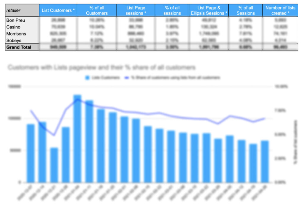
– Quantitative data of Lists usage (adoption and retention)

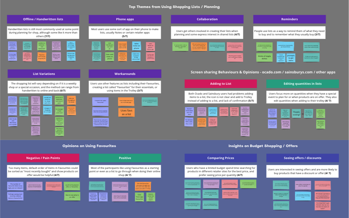
We conducted interviews with 7 List users in the UK. Our analysis, combining qualitative and quantitative data, unveiled some key insights. Firstly, Lists are mostly used by more experienced customers who have been engaging with the platform for five or more shops. Although the feature hasn’t seen rapid adoption, it maintains a consistent level of retention. What’s noteworthy is that users who create Lists tend to develop deeper connections with the feature, most likely because of the time and effort they invest in curating and building their lists.
Affinity mapping from interviews
Data - the image is blurred as information is confidential

Use cases

Most common use cases of shopping lists:

  • Weekly shop (90% of products are the same every week)
  • Special occasions (dinner party, anniversary, Xmas dinner) – often organised with more people

Less common use:

  • Wish list (new products to try)
  • Favourite products from a type of product (A participant had a list of favourite ice creams, another of chocolate bars)


Ideation workshop

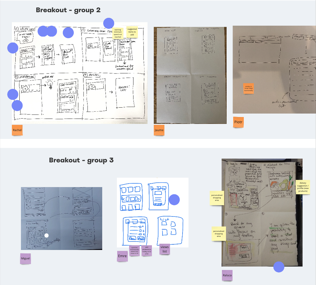
Once we collected insights and use cases from user interviews, we organised a workshop session with the team involved including the PM and developers. During the workshop, we aligned our understanding of the uncovered insights and engaged in ideation exercises to generate multiple solutions and discussed the feasibility of these solutions.

Some sketches from the group ideation workshop

Design explorations

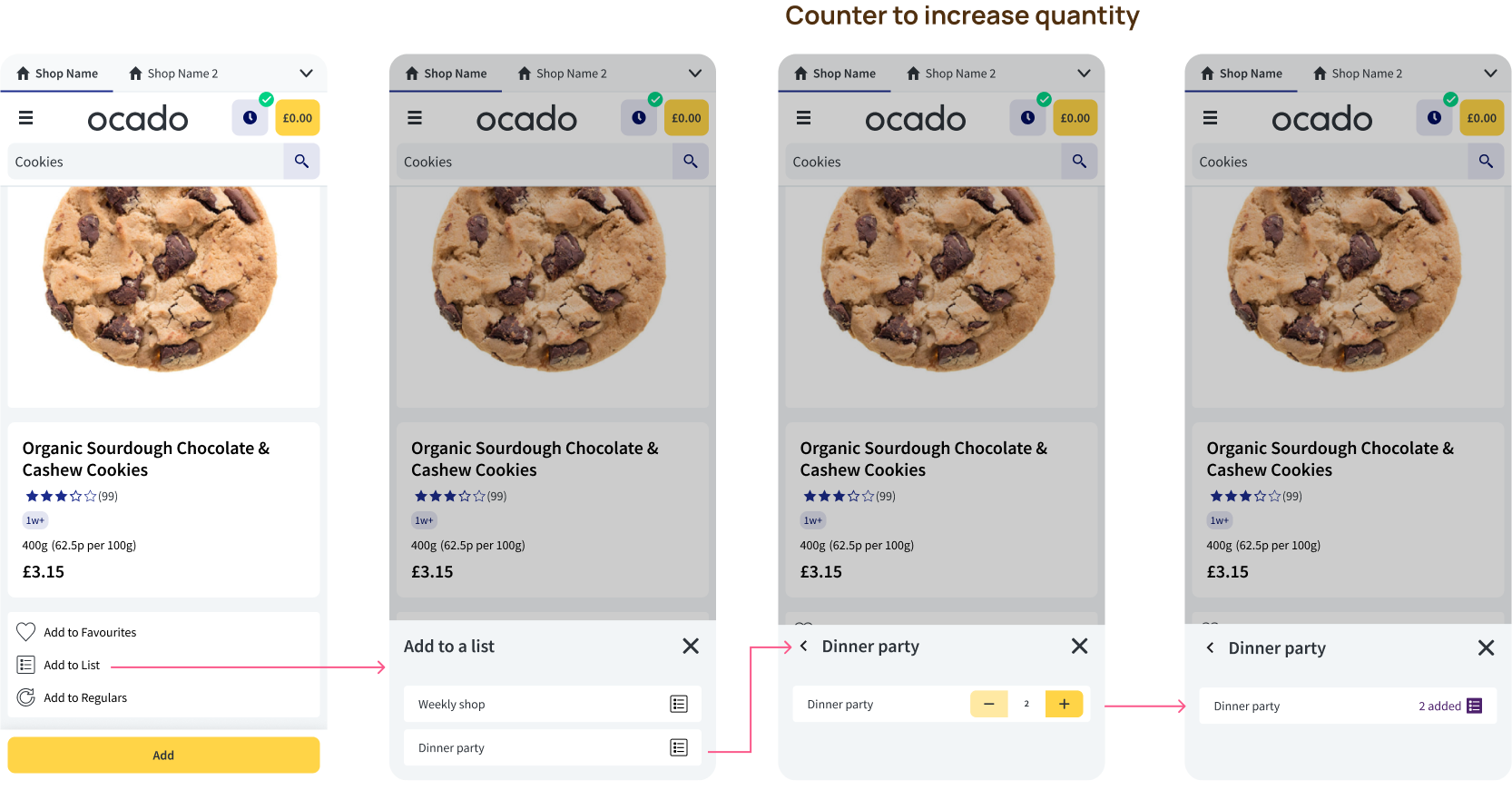
Based on the outcomes of our ideation sessions and the benchmarking research I conducted to identify design patterns in our competitors, I created several design proposals. These solutions not only addressed the addition of quantities in lists but also incorporated other ideas generated during the ideation process. One of those was the inclusion of a sharing sub-feature within the list functionality. To ensure the usability of these designs, I designed a few prototypes to conduct a usability test.

Main flow with edit quantities when adding a product to a list
Overview of other explorations and prototype preparation for test

Usability Test - 4 Scenarios and Tasks

We tested 4 ideas. The first 2 came from the client’s request, but we also took the opportunity to test 2 other concept ideas that came from user insights and ideation workshop with the team.

1. Add product quantities to list

Request coming from Ocado's client

2. Edit quantities from an existing list

Request coming from Ocado's client

3. Convert a past order into a list

Concept idea coming from user's interviews and ideation

4. Share a list

Concept idea coming from user's interviews and ideation

We conducted a moderated usability test with 7 participants.

The goal of the usability test was to understand if:

  • Would the features be useful
  • Can users successfully complete the tasks set?
  • Discover areas for improvement

Findings

Editing product quantities in the Lists or Basket?

7 out of 7

Interviewed participants mentioned they don’t have a problem with changing the quantities in the basket

Quotes from user interviews:

“I don’t have any issues with the way I currently use it.”

“I usually go to my list and add to the basket (..) (even if the feature was live) I would increase the amount in my basket.”

“I would not change the quantities from my list, I prefer to keep as it is, and go to my basket and edit there. Some weeks I need more, some weeks I need less (of a product)”

The usability test results revealed that users were satisfied with the current method of setting quantities in the shopping trolley. In fact, the majority preferred to keep the existing system since their shopping needs varied from week to week, requiring them to adjust quantities accordingly. 

Quote from user:  “Last week I got 1 pack of bread but this week I bought 2 as my girlfriend is staying over” 

We gathered enough evidence to show that users do not have any problems or need to add quantities to their shopping lists – we discussed the test results with the client who requested it and decided to invest time and resources on something that was bringing more value to users.

Share lists with family/friends

6 out of 7

Interviewed participants would use the share lists functionality

On the other hand, the sharing lists concept, which originated from the team’s ideation and insights gathered from user interviews, received overwhelmingly positive feedback. Many participants expressed excitement about the concept. This test played a crucial role in providing substantial evidence and assisting the team in making an informed decision regarding the development of Quantities in Lists.

Share lists concept got a very positive reponse from users

Quotes from user interviews:

“This would be really useful”

“This sharing option is amazing for my dinner party planning”

Final thoughts

After thorough consideration, the team opted not to develop the Quantities in Lists feature due to limited user interest. We gathered evidence to support our decision and push back on the client’s request, instead, prioritised projects aimed at significantly improving overall feature usability. By focusing on the “Sharing Lists” capability, we aim to enhance feature usage and bolster user acquisition, which will also be beneficial for the business. Our user-centric approach, research, and testing led us to make informed decisions and invest time and resources in a feature that can bring value to both users and the business.

© copyright Ligia Olmos 2023

Password protected

Due to the confidentiality of this project, I’m unable to publish it publicly. Reach out to me for the project’s password.

Under construction

This page is currently under construction. For more information please contact me: [email protected]